Hammerfall - New Album Details
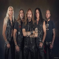
HammerFall will release their new upcoming album, Infected, on May 20th through Nuclear Blast Records.
Laying down the foundation themselves in their own studio in Sweden, the band then traveled to Nashville, TN, to finish it up with acclaimed producer James Michael (Mötley Crüe, Scorpions, Meat Loaf). He also mixed the album, giving it a decisive updated edge without losing anything of the essence of the band.
"James helped us create something that was new and exciting while still in the line of our heritage", Oscar Dronjak, guitar player and founder of the band, explains.
"Never before have we sounded this fresh and up to date without losing the essence of what HammerFall is all about: Pure "Infected" Heavy Metal!", comments vocalist and frontman Joacim Cans.
"You will experience us like you've never done before! We've got a lot of fresh influences shining through in the music, but everything you love about HammerFall will still be there", says Oscar. "This is HammerFall in 2011, the legend has been reborn!".
The first single will be One More Time, to be released on April 6th, digital only. A video will be shot by Patrick Ullaeus, who is also responsible for the cover artwork of Infected.

Infected tracklist:
01. Patient Zero
02. Bang Your Head
03. One More Time
04. The Outlaw
05. Send Me A Sign
06. Dia De Los Muertos
07. I Refuse
08. 666 - The Enemy Within
09. Immortalized
10. Let's Get It On
11. Redemption
Laying down the foundation themselves in their own studio in Sweden, the band then traveled to Nashville, TN, to finish it up with acclaimed producer James Michael (Mötley Crüe, Scorpions, Meat Loaf). He also mixed the album, giving it a decisive updated edge without losing anything of the essence of the band.
"James helped us create something that was new and exciting while still in the line of our heritage", Oscar Dronjak, guitar player and founder of the band, explains.
"Never before have we sounded this fresh and up to date without losing the essence of what HammerFall is all about: Pure "Infected" Heavy Metal!", comments vocalist and frontman Joacim Cans.
"You will experience us like you've never done before! We've got a lot of fresh influences shining through in the music, but everything you love about HammerFall will still be there", says Oscar. "This is HammerFall in 2011, the legend has been reborn!".
The first single will be One More Time, to be released on April 6th, digital only. A video will be shot by Patrick Ullaeus, who is also responsible for the cover artwork of Infected.
Infected tracklist:
01. Patient Zero
02. Bang Your Head
03. One More Time
04. The Outlaw
05. Send Me A Sign
06. Dia De Los Muertos
07. I Refuse
08. 666 - The Enemy Within
09. Immortalized
10. Let's Get It On
11. Redemption
| facebook.com | |
| Band profile: | HammerFall |
Comments
‹‹
Back to News
| BrokenKnuckles Posts: 105 From: USA  |
| Danyael Posts: 91 From: Croatia |
| corrupt With a lowercase c Posts: 3121 From: Germany  |
| FeskarN Posts: 867 From: Sweden  |
| Angelic Storm Melodious Posts: 6675 From: UK  |
| Holy Man STEEL DEFENDER Posts: 220 From: USA  |
| WorpeX Made of Metal Posts: 1347 From: USA  |
| Angelic Storm Melodious Posts: 6675 From: UK |
| Vombatus Potorro Posts: 2354 From: Spain  |
| JÄY Metal slave Posts: 1567 From: USA  |
| Kingface Posts: 335 From: UK  |
| RavenKing Posts: 1941 From: Canada  |
| Mechanixxxx Posts: 33 From: Puerto Rico  |
| vinajadul Posts: 1 From: Indonesia  |
| mikeprado30 Posts: 1273 From: Costa Rica  |
| ockletters Posts: 9 From: Romania  |
| atkmetal123 Posts: 60 From: Vietnam |
| Metal Invader Posts: 356 From: Croatia  |
| dragonfire1603 Posts: 22 From: Switzerland  |
| Troy Killjoy perfunctionist Posts: 21306 From: Canada  |
| Angelic Storm Melodious Posts: 6675 From: UK |
| Troy Killjoy perfunctionist Posts: 21306 From: Canada |
| Angelic Storm Melodious Posts: 6675 From: UK |
| Elodie Artour Slania Posts: 1175 From: The Netherlands  |
| Endogenisis_ Posts: 2 From: France  |
| Thryce Retired Staff Posts: 4346 From: Belgium  |
 that would be too funny.


Hits total: 5422 | This month: 6