Metal Storm logo
Baroness - Full Cover Artwork Revealed


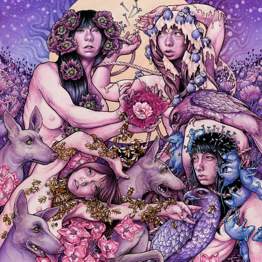
After unveiling their new album details and streaming the "Chlorine & Wine" official video, Baroness have now completed the picture and unveiled the full cover of their impending release Purple. As with all of their previous albums, the artwork was designed by the band's frontman John Baizley and is available below. How do you like it?


The opus will be released by Relapse Records on December 18th.

Source: facebook.com
Band profile: Baroness
Posted: 31.10.2015 by Pazdzioch


Comments

‹‹ Back to News
Comments: 5   Visited by: 110 users
31.10.2015 - 21:09
Ocean Sage

Wow, normally I'd say Baroness' album covers are beautiful, but this is an ugly cluttered mess of people, animals, and purple.
Loading...
01.11.2015 - 07:51
Necrotion7

I agree 100%
Loading...
01.11.2015 - 13:14
Netzach
Planewalker
Looks like every other cover this guy makes. Boobs, animals and inexplicable white goo all over the place. I don't get it.
Loading...
01.11.2015 - 13:27
Karlabos
Meat and Potatos
Written by Netzach on 01.11.2015 at 13:14

"inexplicable white goo" all over the place. I don't get it.

=]
----
"Aah! The cat turned into a cat!"
- Reimu Hakurei
Loading...
08.11.2015 - 07:41
afu

I remember that woman was with him on the last tour of the States. I think all 4 women are different versions of her with different symbols for fertility/sex, drugs, muse, and death. 3 of my favorite artisticals are Dali, Giger, and Klimt. They pack a lot of things into one picture, so it isn't unusual. It flows from the bottom left, going counter-clockwise.

I think the colors are dissonant. The cool against warm and the way it is jarring to the senses, because they strike each other. Combined with the symbolism, it makes sense, conceptually, but isn't pretty to look at. Even the purple hue is like a pallor. Very depressing.
Loading...

Hits total: 1899 | This month: 4