


Wintersun - Reveal New Album Cover Art

Official press release:
"Sons of winter and stars - Rise!"
This short but significant excerpt of the track "Sons Of Winter And Stars" not only is the wake-up call for everyone interested in music, it's the battle cry of a band that released their self-titled debut album eight long years ago and had had to live up to the highest expectations and pressure of time for the eagerly awaited successor ever since. As Wintersun turned out to be a critically-acclaimed masterpiece of musical art, the band unintentionally found themselves facing the situation of having to out-do their previous work, and soon.
2012 it's finally time to unleash Wintersun's second full-length album Time I. Over the course of eight years the band have taken both music and visuals to yet another level and while listening to their new effort you'll be taken on a journey through the doors of time, a journey beyond the stars, beyond the birth of the worlds to an infinite universe.
Finland's epic metallers will release their long-awaited album Time I on October 12 before hitting the road in October/November headlining the so-called Heidenfest tour. Recently the band went into the studio with photographer Nana Simelius to shoot the new pictures for the upcoming album and now the breathtakingly beautiful front cover of Time I has been unveiled.
Commented the band: "We searched many options who could actually make the cover for Time I. Cameron's way of creating art was just something that stood out immediately and we feel it suited best for Jari's vision as a cover for Time I. We are really happy for the result and hopefully this collaboration continues in the future releases as well!"

Time I tracklist:
01. When Time Fades Away
02. Sons Of Winter And Stars
1 - Rain Of Stars
2 - Surrounded By Darkness
3 - Journey Inside A Dream
4 - Sons Of Winter And Stars
03. Land Of Snow And Sorrow
04. Darkness And Frost
05. Time
"Sons of winter and stars - Rise!"
This short but significant excerpt of the track "Sons Of Winter And Stars" not only is the wake-up call for everyone interested in music, it's the battle cry of a band that released their self-titled debut album eight long years ago and had had to live up to the highest expectations and pressure of time for the eagerly awaited successor ever since. As Wintersun turned out to be a critically-acclaimed masterpiece of musical art, the band unintentionally found themselves facing the situation of having to out-do their previous work, and soon.
2012 it's finally time to unleash Wintersun's second full-length album Time I. Over the course of eight years the band have taken both music and visuals to yet another level and while listening to their new effort you'll be taken on a journey through the doors of time, a journey beyond the stars, beyond the birth of the worlds to an infinite universe.
Finland's epic metallers will release their long-awaited album Time I on October 12 before hitting the road in October/November headlining the so-called Heidenfest tour. Recently the band went into the studio with photographer Nana Simelius to shoot the new pictures for the upcoming album and now the breathtakingly beautiful front cover of Time I has been unveiled.
Commented the band: "We searched many options who could actually make the cover for Time I. Cameron's way of creating art was just something that stood out immediately and we feel it suited best for Jari's vision as a cover for Time I. We are really happy for the result and hopefully this collaboration continues in the future releases as well!"
Time I tracklist:
01. When Time Fades Away
02. Sons Of Winter And Stars
1 - Rain Of Stars
2 - Surrounded By Darkness
3 - Journey Inside A Dream
4 - Sons Of Winter And Stars
03. Land Of Snow And Sorrow
04. Darkness And Frost
05. Time
| wintermadness.net | |
| Band profile: | Wintersun |
Comments
‹‹
Back to News
| Andrew_Deer None,really Posts: 60 From: Czech Republic  |
| annodomini Posts: 782 From: Lithuania  |
| @gent_-_orange Posts: 905 From: UK  |
| Zap Guest Posts: 3516  |
| Windrider Raureif Posts: 684 From: Germany  |
| Hallford9000 Posts: 242 From: Germany  |
| !J.O.O.E.! Account deleted |
| kaspair Posts: 67 From: The Netherlands  |
| Marcel Hubregtse Grumpy Old Fuck Posts: 40071 From: The Netherlands  |
| Warman Erotic Stains Posts: 7695 From: Sweden  |
| flamesoficarus Posts: 135 From: Australia |
| Kuroboshi Posts: 1168 From: Sweden  |
| BlueMobius Account deleted |
| Boxcar Willy yr a kook Posts: 8977 From: Canada  |
| Carl Berg Carl Berg Posts: 589 From: Luxembourg  |
| Alex F Slick Dick Rick Posts: 3502 From: USA 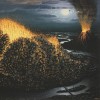 |
| Mongoose2557 Account deleted |
| X5452 Account deleted |
| Hallford9000 Posts: 242 From: Germany |
| TrollandDie Posts: 274 From: Ireland  |
| gopherhawk2@gmail.co Posts: 257 From: USA  |
| Wes Posts: 423 From: Japan  |
| Methuselah Posts: 71 From: USA |
| @gent_-_orange Posts: 905 From: UK |
| Wes Posts: 423 From: Japan |
| Mad Arab666 Posts: 299 From: UK  |
| Wes Posts: 423 From: Japan |
| Opethian Posts: 1728 From: USA  |
| J. N. Account deleted |
| BlueMobius Account deleted |


Hits total: 9747 | This month: 9