Mad Laughter
Account deleted |
Mad Laughter
Account deleted
OMFG great band dude
Loading...
|
BurbotsRevenge
Foetal Butchery
Posts: 1602  |
love the glorior belli - brilliant - especially the 2nd one with extraness...
heres another good one - i came across this band just recently and they play some solid melodeath, but they also have a great logo...

Burden of Grief
Loading...
|
RockeRoy
Posts: 641  |
Sepultura!! and the metallica star is cool to
----
You found god? If nobody claims him in thirty days, he's yours
Walk with me in hell
Loading...
|
DrunkenFuck
Thrasher!
Posts: 455  |
My favourite is definately Metallica (the old one). It just says "thrash" when you look at it. Awesome.
----
THRASH!!!
Loading...
|
Anarchist
Posts: 70  |
Probably the old Immortal logo, it's just got everything in it at once. Also check out Impaled Nazarene's and Brain Drill's logos.
Also have to mention Mayhem and Marduk.
Last of all I'd have to mention Dethklok, over the top and metal, just like everything else about them.
Loading...
|
Clintagräm
Shrinebuilder
Posts: 5772  |
Even though I'm not a huge fan of Possessed, I do enjoy their music. Their logo is awesome though. Some might thinks it's cheesy, but I think it's right down at the heart of Metal.


----
The force will be with you, always.
Loading...
|
Inlé
Posts: 334  |

Has an awesome old school vibe, and mixing sci fi/spacey things like wires and lightning bolts with inverted pentagrams is ftw.
Loading...
|
Clintagräm
Shrinebuilder
Posts: 5772 |
Nice one whippersnapper. Another favorite of mine, whom I am currently listening to:
----
The force will be with you, always.
Loading...
|
Nox Lux
codebreaker
Posts: 1979  |
man, some of these are seriously awesome. This one's not technically as good as some of yours, but it's got real soul. This Wolves In The Throne Room logo appeals to my artistic side because of it's character and originality:

It's the same as my avatar, but looks much better bigger - which you can see if you check out the band's invisible profile
My second favourite is probably the other one on the profile site for WITTR! It looks much better on the actual cover to Two Hunters. Here it's in black and grey and those two colours don't really do it justice.
I must admit that this is biased since i love the band. Otherwise I'd probably go for something similar to the Burden Of Grief logo - which is fucking amazing by the way.
----
][{ ]|/ ][_ "][" -- ][3) ][_ /=|[ [( ][{ -- ][][][ |E[ "][" ]|= ][_
"Thoughts fall in season with the right stand, rake the land
This Autumn's early leafshed a recompense for Summer's wane."
~ Nox Lux
Loading...
|
Warman
Erotic Stains
Posts: 7695  |
WarmanErotic StainsPosts: 7695
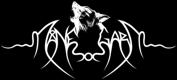
My new favourite is Månegarm! Such an awesome logo with that wolf (garm). Second is probably Opeth, very beautiful.
----

Loading...
|
+{Jonas}+
I R Serious Cat
Posts: 4955  |
Ensiferum is another favorite, 'cause it's symetric and it looks kinda folky, celtic...
----
"Nobody wants to be the weird kid, you just end up being the weird kid. You don't know how you ended up getting there" - Rob Zombie
http://jonas-bs.deviantart.com My dA, mainly photography, go check it out!
Loading...
|
rageing atheist
Account deleted |
rageing atheist
Account deleted
Written by Inlé on 01.04.2008 at 13:32
Has an awesome old school vibe, and mixing sci fi/spacey things like wires and lightning bolts with inverted pentagrams is ftw.
I agree, the Nocturnus logo is one of the best logos ever created. Fucking brilliant.
Loading...
|
AnKleDork!
Account deleted |
AnKleDork!
Account deleted
gotta be the metallica star:Dand i think heartagam of HIM is kinda cool...even if its not metAL.
the cadle of filth logo whas kinda cool, on the newest album thornography
Loading...
|
Lucas
Mr. Noise
ElitePosts: 13427  |
LucasMr. NoiseElitePosts: 13427
There are a couple of great logo's posted here. yet my all time favourite, which is obviously biased cause its my favourite band anyway, is SHINING!

It's so simple, subtle, gentle to the eye. But very confronting, sharp, brutal, very strong contrast between the black and white.
----
SLUDGE. DOOM. DEATH. Wait, what?
 "The reason I'm running for president is because I can't be Bruce Springsteen."
 - Barack Obama
Loading...
|
MetalShadow
Account deleted |
MetalShadow
Account deleted
I like the Darkthrone logo
Loading...
|
Colony
Account deleted |
Colony
Account deleted
Moonsorrow's for the simple reason that it just looks aesthetically pleasing and it matches the band perfectly
Loading...
|
Anarchist
Posts: 70 |
Forgot to mention Satanic Warmaster, a truly epic logo. Pretty much impossible to imitate except by a professional artist.
Loading...
|
X-Ray Rod
Skandino
StaffPosts: 18278  |
Written by Lucas on 03.04.2008 at 21:06
There are a couple of great logo's posted here. yet my all time favourite, which is obviously biased cause its my favourite band anyway, is SHINING!
I love the fact that it's very symetric 
A very well done logo.
Opeth is also one of my favorite cause the effects on the "O" are just beautiful... dark and elegant.
----
Written by BloodTears on 19.08.2011 at 18:29
Like you could kiss my ass Written by Milena on 20.06.2012 at 10:49
Rod, let me love you.
Loading...
|
addiction
Posts: 277  |
to be honest i usually do not like metal logos that much because you cannot even read them...and they look like scribblings...of course thats a personal thing completely...
there are a couple that are good, like the ones from dream theater, sentenced and bloodbath for different reasons,
but the one that automatically came to mind and i absolutely love and think is the best (and i am not being very original here) is opeth...that O is just beautiful in all ways!!!
----
alive in the superunknown
Loading...
|
Vinnie R.
Chido Chido
Posts: 937  |
The Black Metal logos are just insane, and the kris Verwimp are amazing, surely those are the best band logos, very artistic.
Loading...
|
Frija
Posts: 16  |
The old Immortal logo. It's on the Pure Holocaust and Battles in the North covers.
Loading...
|
carlithrashinmad
Account deleted |
carlithrashinmad
Account deleted

Although the logo is so great to me I think I love the damn soldier, it just tells you what Sodom is about! rage raw yeahhh aaaaghhh
Loading...
|
GULCH OF ROT
Posts: 72  |
----
AND ON THE 7TH DAY THE GULCH BEGAN TO ROT
http://www.myspace.com/gulchofrot
Loading...
|
ForeverDarkWoods
Posts: 1001  |
----
Free nations are peaceful nations. Free nations don't attack each other. Free nations don't develop weapons of mass destruction!
- George W. Bush, ex-president of the United States of America
Loading...
|
TheBigRossowski
Posts: 1355  |
Written by X-Ray Rod on 24.04.2008 at 23:09
Written by Lucas on 03.04.2008 at 21:06
There are a couple of great logo's posted here. yet my all time favourite, which is obviously biased cause its my favourite band anyway, is SHINING!
I love the fact that it's very symetric
A very well done logo.
Opeth is also one of my favorite cause the effects on the "O" are just beautiful... dark and elegant.
Agreed... but uh, sir, not to burst your uh... metaphorical, uh, bubble, but most bands lend themselves to symmetrical logos.
My favorite logo is the Forest of Stars one! Not too many people notice the special things about the forest.  ...A very fitting logo for a group of Gentlemen.

----
That rug really tied the room together, did it not?

Loading...
|
X-Ray Rod
Skandino
StaffPosts: 18278 |
Written by TheBigRossowski on 25.04.2009 at 15:49
Agreed... but uh, sir, not to burst your uh... metaphorical, uh, bubble, but most bands lend themselves to symmetrical logos.
Yeah, the Mr. Doctor of the present agrees with you since the one that lived a year ago was a bit obvious.
----
Written by BloodTears on 19.08.2011 at 18:29
Like you could kiss my ass Written by Milena on 20.06.2012 at 10:49
Rod, let me love you.
Loading...
|
TheBigRossowski
Posts: 1355 |
Written by X-Ray Rod on 26.04.2009 at 00:16
Written by TheBigRossowski on 25.04.2009 at 15:49
Agreed... but uh, sir, not to burst your uh... metaphorical, uh, bubble, but most bands lend themselves to symmetrical logos.
Yeah, the Mr. Doctor of the present agrees with you since the one that lived a year ago was a bit obvious.
Oh...didn't take note of the date... doesn't matter. Not all privy to this new shit. Oh...by the way, do you think that you could give me that $20,000 in cash? My concern is, and I have to, uh, check with my accountant, that this might bump me into a higher, uh, tax...
----
That rug really tied the room together, did it not?
Loading...
|
Deadmeat
Necrobutcher
Posts: 2437  |
Fuck... there are too many really great logos from bans.. from really simple (kreator, deicide, obituary) to more complex (bloodbath, morbid angel, naglfar) i love them all!!!!!!!!!
----
Υou've sold your human essence to the cold world of dead and empty things... You're SOLD!
Loading...
|
Marcel Hubregtse
Grumpy Old Fuck
ElitePosts: 40071  |
The old original metallica logo, simple yet so effective and it just screamed METAL at you.
----
Member of the true crusade against European Flower Metal
Yesterday is dead and gone, tomorrow is out of sight
Dawn Crosby (r.i.p.)
05.04.1963 - 15.12.1996

Loading...
|
Haddonfield
Chucky's Bride
Posts: 1993  |
My favorites would have to be the old Metallica, Slayer, Cradle of Filth (black metal logo but you can still easily read the band's name) and an old favorite of mine, Korn's with the back to front R.
----

"Seasons don't fear the reaper. Nor do the wind, the sun and the rain (we can be like they are)."
Loading...
|