Oaken
Hipster
Posts: 1322  |
Reminds me very much of their debut's cover.
----
In that case, man is only air as well.
Loading...
|
kaspair
Posts: 67  |
Loading...
|
Windir
Posts: 95  |
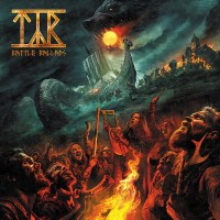
Like in every Ensiferum release, we have water, the same old guy and the same suomi shield, but this time there is an aurora borealis ha ha... Musically, the awesomeness is absolutely guaranteed!
Loading...
|
Promonex
Cathemeral
ElitePosts: 9720  |
Pink, the new black?
----
All life begins with Nu and ends with Nu... This is the truth! This is my belief! ...At least for now.
- The Mystery of Life, Vol. 841 Ch. 26
Loading...
|
Windrider
Raureif
Posts: 684  |
Loading...
|
Icy
Account deleted |
Icy
Account deleted
Love the red tone! I have the last two covers as flags hanging on my wall and this is going to go there as well.
Loading...
|
J:oKeR
Posts: 49 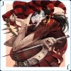 |
Nice....:)
----
Aaaaaaaaaa
Loading...
|
Waniyetu
Posts: 26  |
Their best cover yet, even if it is similar to the first.
Loading...
|
pojechany
Posts: 13
|
Isn't it exactly the same color as chaos flames form Warhammer?
Loading...
|
JÄY
Metal slave
Posts: 1567  |
JÄYMetal slavePosts: 1567
Love Wåhlin's work... I swear every other metal band on earth has had a cover done by him.
Loading...
|
moe5512
Posts: 501  |
I don't like it, it looks like a catholic propaganda poster
Loading...
|
Mattybu
Posts: 2589  |
Written by moe5512 on 27.06.2012 at 22:19
I don't like it, it looks like a catholic propaganda poster
So the presence of an old bearded man makes it a catholic propaganda poster? 
I really see nothing religious on it...
Loading...
|
Boxcar Willy
yr a kook
Posts: 8985  |
I love all of their artwork.
Loading...
|
ndawkn
Posts: 35
|
Well that's very.. Ensiferum-ish. Väinämöinen and other references to Kalevala and a Finnish flag. The colour theme is a bit weird though.
Loading...
|
gopherhawk2@gmail.co
Posts: 257  |
Love the surprise.
----
Follow your heart, not trends.
Loading...
|
moe5512
Posts: 501 |
Written by Mattybu on 27.06.2012 at 22:38
Written by moe5512 on 27.06.2012 at 22:19
I don't like it, it looks like a catholic propaganda poster
So the presence of an old bearded man makes it a catholic propaganda poster?
I really see nothing religious on it...
gotta be high, bro, gotta be high
Loading...
|
~Starchild~
Posts: 89  |
Absolutely mazing album cover, I love the colour!
But I guess this will be the best part of the album :-/
Loading...
|
Nemmeth
Posts: 16  |
You can clearly see the artist improve when you compare Ensiferum's oldest covers to the newest. Cool.
I think I like this cover the best too.  For some reason red seems a bit out of place yet makes the cover awesome? whatever :p
Loading...
|
BlueMobius
Account deleted |
BlueMobius
Account deleted
That color scheme is gorgeous. Hope the music is too.
Loading...
|
Josh Gottret
Posts: 39  |
The same shield...and the same guy...always!
Hahahahahaha!!! 
We can expect a really awesome disc, at least after the release of "FROM AFAR". 
Loading...
|
FeskarN
Posts: 867  |
Love the artwork. Wåhlin's work is always fantastic. The colours are amazing and it looks kinda similair to the first album. can't wait to hear the music now.
----
The Land Is Silent... Before The Storm!
Loading...
|
malaikat
Posts: 405  |
Loading...
|
Ukko
Posts: 7  |
Written by moe5512 on 27.06.2012 at 22:19
I don't like it, it looks like a catholic propaganda poster
WTF? "Catholic propaganda poster"?? WHY?
Loading...
|
qlacs
"The Quaker"
Posts: 1537  |
qlacs"The Quaker"Posts: 1537
I love Iron's and From Afar's cover, but this one is seems to be a bit better, although it reminds me more of computer-painted stuff...
----

Loading...
|
Cal Wolvington
Account deleted |
Cal Wolvington
Account deleted
It's fucking purple.
Loading...
|
EmeraldSword
Posts: 179  |
I like the album artwork and use of red. I interpreted the "pink" tone purely as mist coming off the water. Here's to hopefully a good album too!
Loading...
|
Troy Killjoy
perfunctionist
StaffPosts: 21306  |
The red probably symbolizes the blood of the unsung heroes that have been slain in battle.
----
"Wise men talk because they have something to say; fools because they have to say something."
Loading...
|
TG_LAX
Posts: 4  |
Damn the artwork is just to awesome:)
Loading...
|
Wintersun616
Posts: 34  |
Written by Troy Killjoy on 28.06.2012 at 17:39
The red probably symbolizes the blood of the unsung heroes that have been slain in battle.
Thought the same thing myself.
I like the artwork and don't mind the color scheme at all.
Loading...
|
Zap
Guest
Posts: 3517 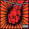 |
ZapGuestPosts: 3517
First time he isn't holding his sword. Or at least like, leaning on it.
Loading...
|